Binning in Looker

Katherine Gillespie, Product Manager
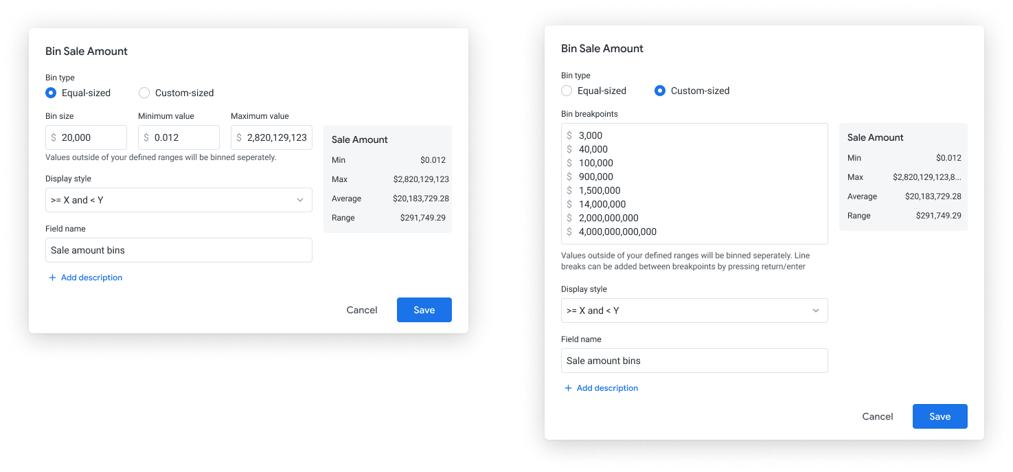
In Looker, we offer users options to create custom bins in the UI that do not require complex nested IF statements. However, users struggled with the UI. The below images shows the previous way Looker offered custom binning.
the pain points
Based on the user feedback and their pain points, we finalized a set of goals that our new binning functionality should achieve.
- More customization. Users wanted other labeling styles for their bins, including custom labeling.
- User-friendly editor. Users were confused as to what they needed to input into the fields.
My role was to think of a design to address the usability and comprehension issues. Users should understand exactly how their data is being bucketed.


the design process
I first brainstormed and sketched out concepts. Then, I brought these ideas into wireframes to continue refining these explorations and presented them to the team for feedback.
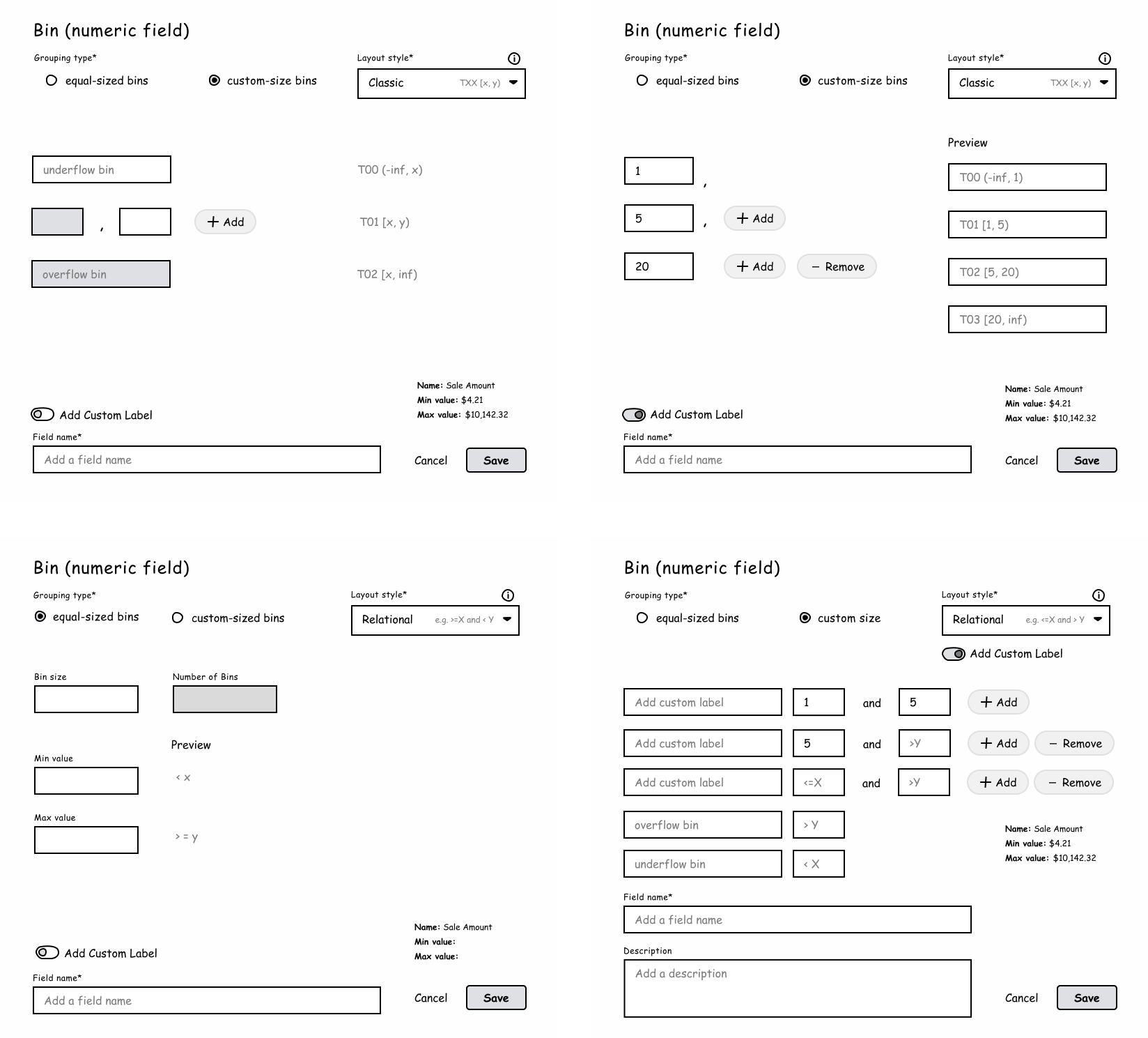
The team liked the idea of showing our business users bin ranges because this allows them to see exactly how the ranges are going to being defined (instead of having to guess or first run the data).

exploring different designs
We explored multiple design patterns for displaying and editing descriptions. The top questions we asked ourselves were:
- Should it always display or display on hover?
- How can we perform this in a way that isn’t too distracting?
- What’s a solution that will work for when there isn't a description?
- How might one edit these descriptions?
- What if customers want to add longer descriptions?
The biggest hurdle to this design was our ambiguity with the general length of user descriptions. However, we surveyed internal Looker users to identify the length of context and found that the descriptions tend to be short, averaging approximately 200 characters (including spaces).
After quite a few iterations, we narrowed down to two top solutions, taking into account the technical constraints of the product.
iterations...
Our ideal solution is one where upon hovering over the tile, a description appears for the end user. We like this design because it removed unnecessary distractions from descriptions that could be too noisy for the end user. We also wanted to break away from the tooltip element since the product heavily utilizes this form of display.

Recognizing that this new workflow could potentially pose a more technical problem, we created another design that took into considerations the current pattern for board descriptions and applied that similar model for each board thumbnail instead. Admittedly, this is less exciting but functional and serves the design purpose.

outcome
We met with an engineer to discuss the technical limitations of a hovering description state, and to our delight, we learned that this design was very doable! After finalizing this solution, we prototyped the interaction to show a more refined design on how the elements would move and presented this for Hack Week Nov 2020.